3. Great Visual Design
This is the part of the movies that Jackson is least directly responsible for. The two artists that Jackson selected, John Howe* and Alan Lee are top fantasy illustrators. Their work does a very good job of evoking the majesty of Tolkien's world without the schlockiness most people associate with fantasy art. Moreover Howe and Lee have managed to create a set of aesthetics that are not historical, but are grounded enough in history to seem real.
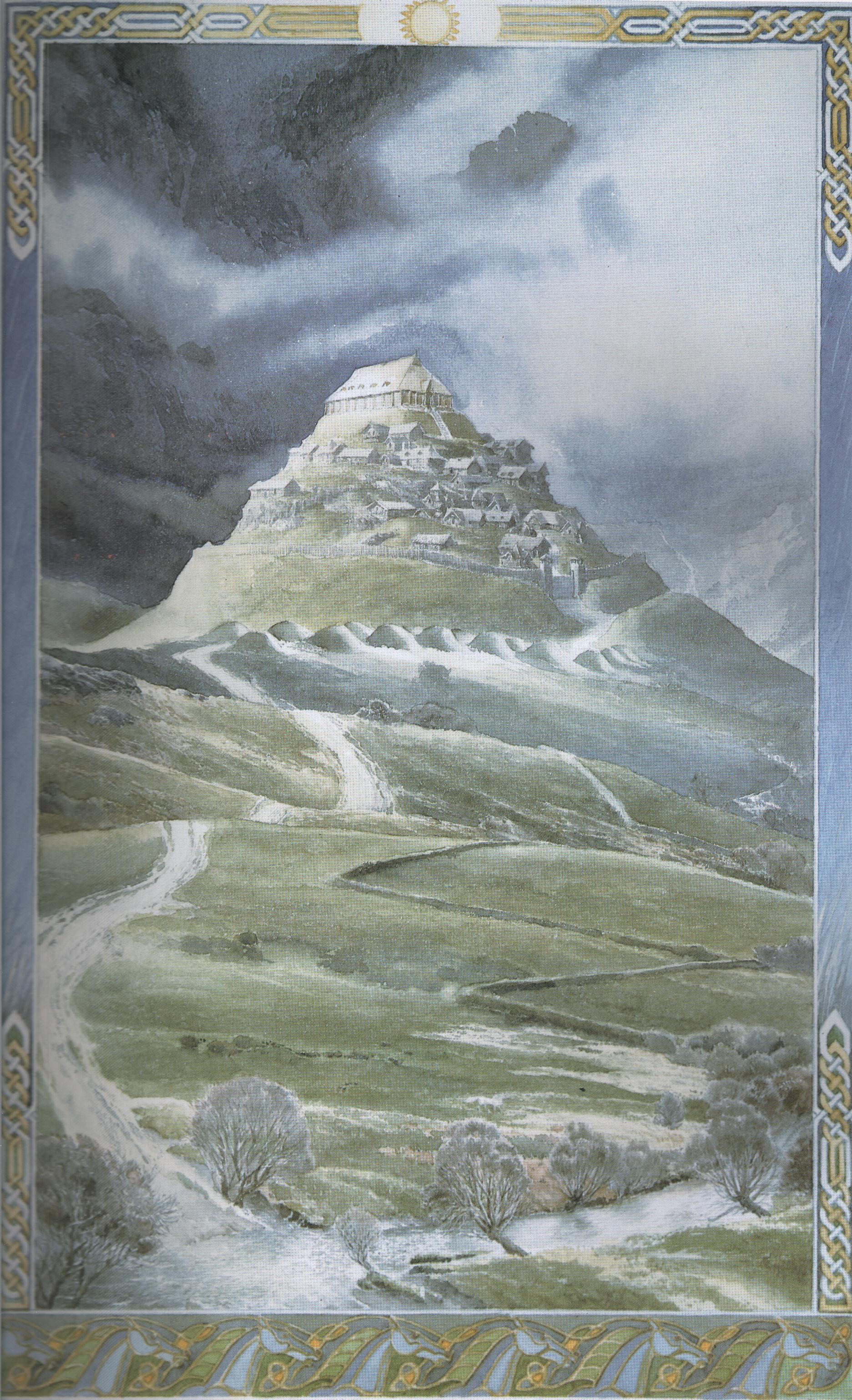
The shire is a sort of idealized Georgian England that never was. Gondor is a combination of Renaisance Italy (the piazzas), Byzantium and the greek isles (those white buildings stacked on top of each other, going down the slope of Minas Tirith). Rohan looks like Anglo-Saxon England meets the viking age. And the Elves live in a more fantastical world that looks like William Morris meets Art Nouveau. Each aesthetic fits the culture that adopts it -- the elves' world is warm and organic, Gondor's is vast and somewhat cold stone, the shire is homelike and simple.
 |
| The Throne Room of Gondor kinda looks like pisa and salisbury cathedrals mashed up. |
In general, aesthetics that have very strong or specific associations (gothic architecture, classical architecture) have been avoided or subsumed into a hodge-podge of somethings that people will half-remember enough to seem real, but will not look like it is from a particular time or place (this is less true of Rohan, most true of Gondor). For instance, the Gondor throne room has the black/white motif of Romanesque Italy, but the simple piers of a gothic cathedral.
On the other hand, the aesthetics of the 'bad guys' have been so broadly copied that it is hard to see them with fresh eyes. But like the movie's other aesthetics they have a certain sleekness, in contrast with the clutter one often sees in fantasy art. Moreove, Barad Dur is genuinely menacing, a great combination of teeming, chaotic industry and something supernaturally evil. And the creature design for the forces of evil is perfect -- the orcs look less like a people and more like they were twisted out of violating something else, and the trolls and hulking but menacing.
Moreover, the aesthetics are original enough that they create a strong impression -- the elves do not look like the fantasy elves that came before, but like something original. The Dwarves don't wear horns on their helmets (nor do the Rohirrim), etc. I think this is important in differentiating the movies from the world of high fantasy that came into being after Tolkien wrote. Tolkien wrote something new when he wrote about the quest to destroy the ring, and the movies had to capture that new-ness to do the books justice, and a new aesthetic was essential to this***.
4. Great Props
I am a sword and armour nut. And with a few exceptions**, the weapons and armour of LOTR look like something people would actually use. Rather than making Anduril or Glamdring some conan-style monstrosities, they are functional and pretty well-balanced swords. Rather than being made by a props guy, they were made by Peter Lyon, a swordsmith with extensive experience recreating historical swords for reenactors. The armour, likewise, is neither super-flashy nor clunky -- often fantasy and historical movies will either make armour too ornamented to be practical, or make it hideous and slab-sided in an effort to provide a 'realistic' and 'battle-worn' aesthetic. See the Game of Thrones TV show for ample examples of both.
The same can be said of the clothing -- it is closely based enough on a mish-mash of historical styles (high medieval for the Dunedain, 18th century for the hobbits, artistic dress movement for the elves) that it actually looks like something people would wear. The construction is generally solid, and the materials are not egregiously synthetic. Again, a blending of historical inspiration and fantasy ensures that Middle Earth really seems like a long-lost world, but one that actually might have existed.

*As a medieval reenactor I am obligated to point out that Howe is a senior member of the premier 15th century reenacting group The Company of Sainte George. I suspect his interest in historical artifacts is one of the things that makes his art a bit more...restrained than other fantasy illustrators -- the nazgul's armour and that of his horse looks like something someone would actually wear.
**The breastplates of the Gondor soldiers are cut too low (below the natural waist, almost to the hips) which makes the soldiers move awkwardly.
***As well as to escape the unfortunate associations of fantasy schlock like the Sword of Shannara. One of the challenges of the movies was to be taken seriously, and so they shouldn't -look- like fantasy.
No comments:
Post a Comment